
EAST BAJA, MEXICO
Punta Perfecta
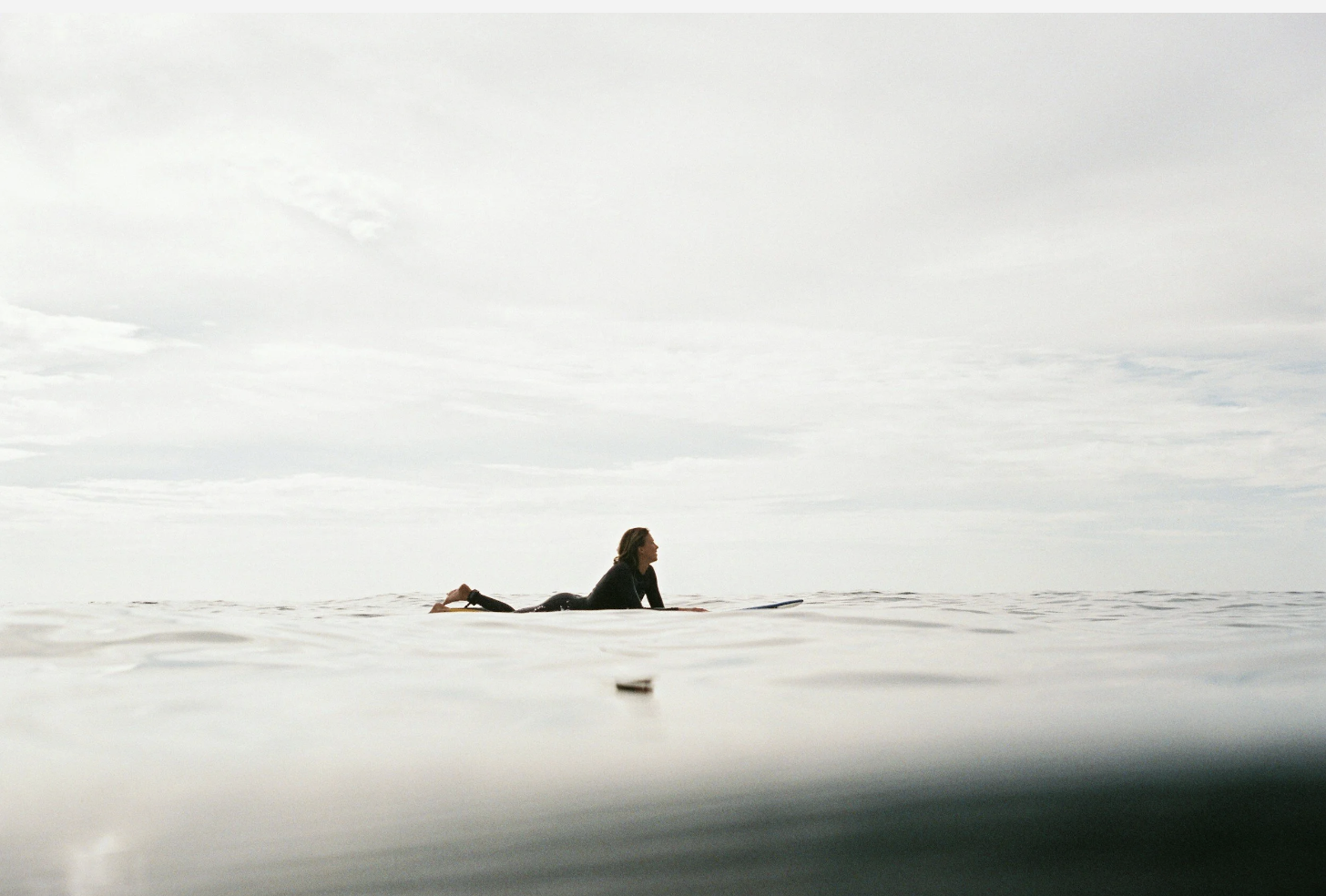
Brand identity and collateral for a private surf club located at the coveted Punta Perfecta surf break in the Sea of Cortez.
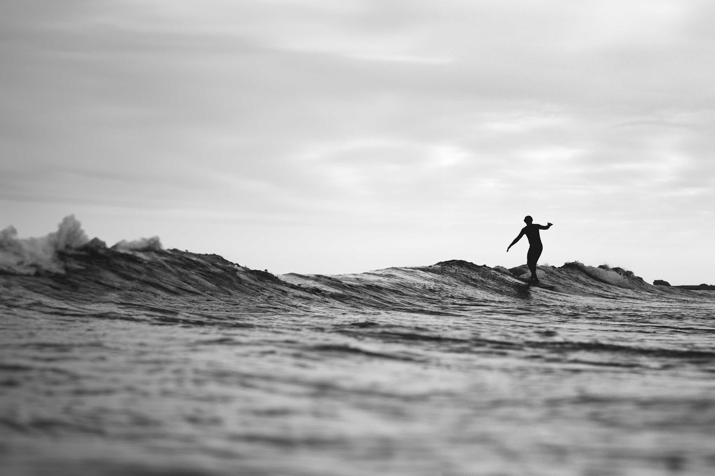
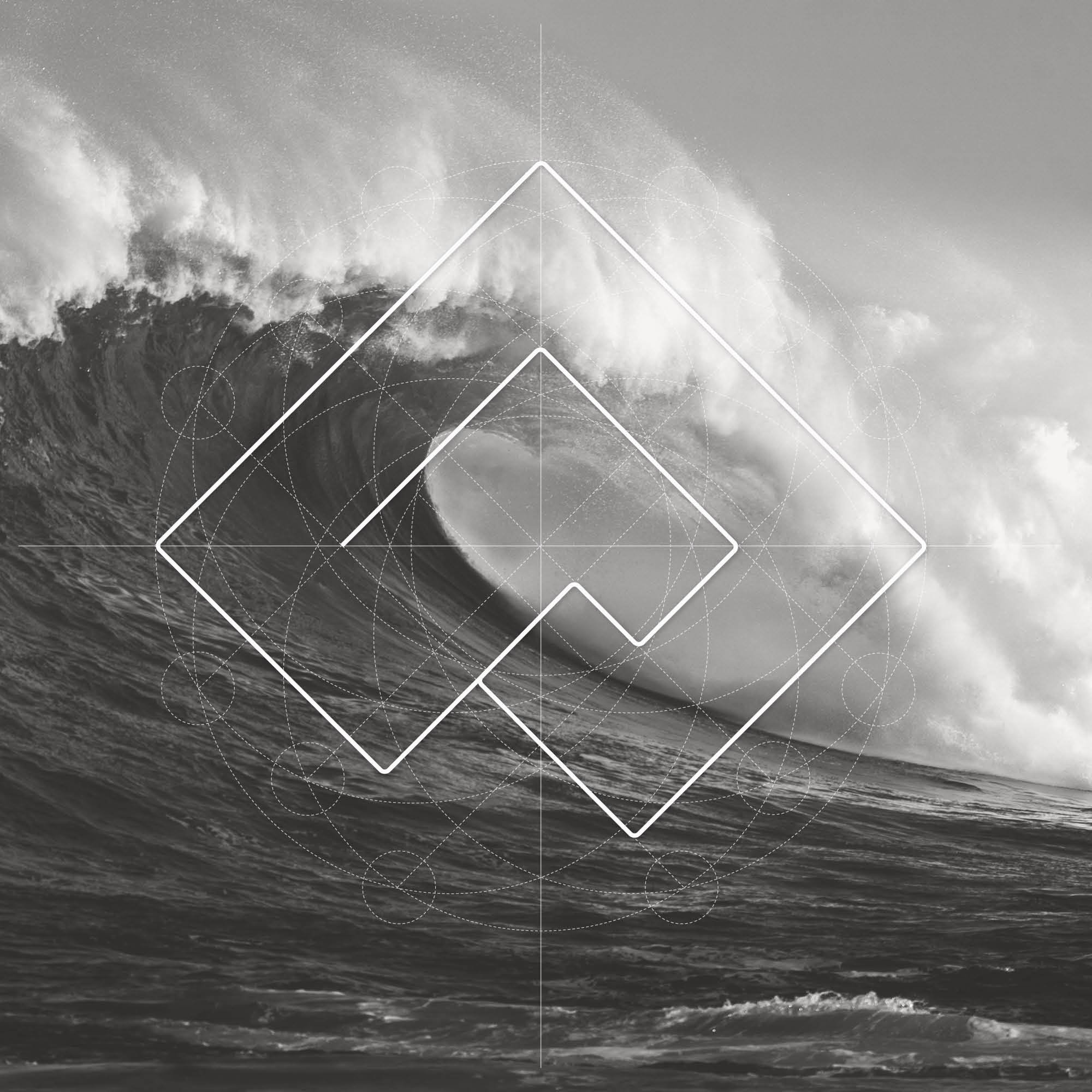
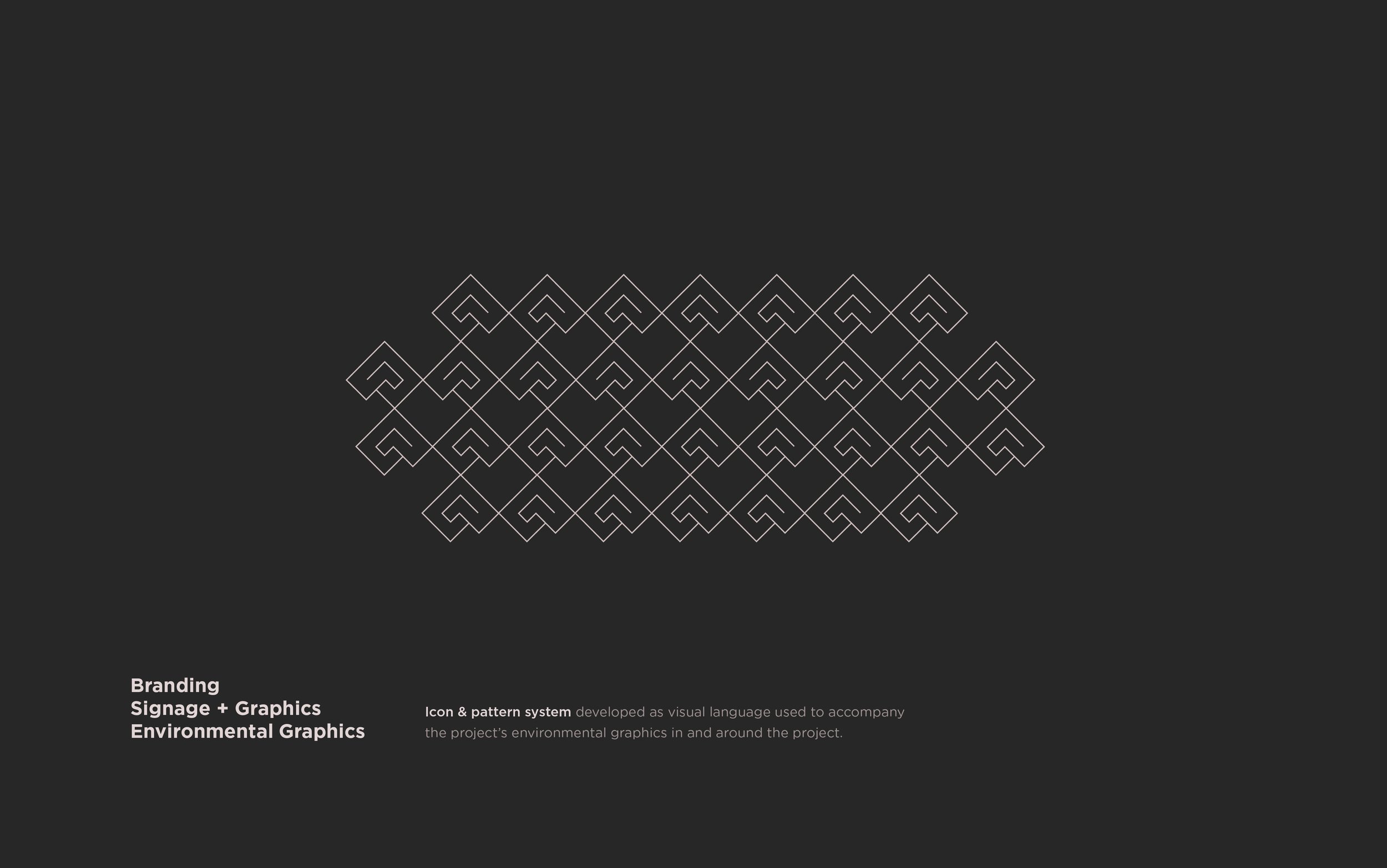
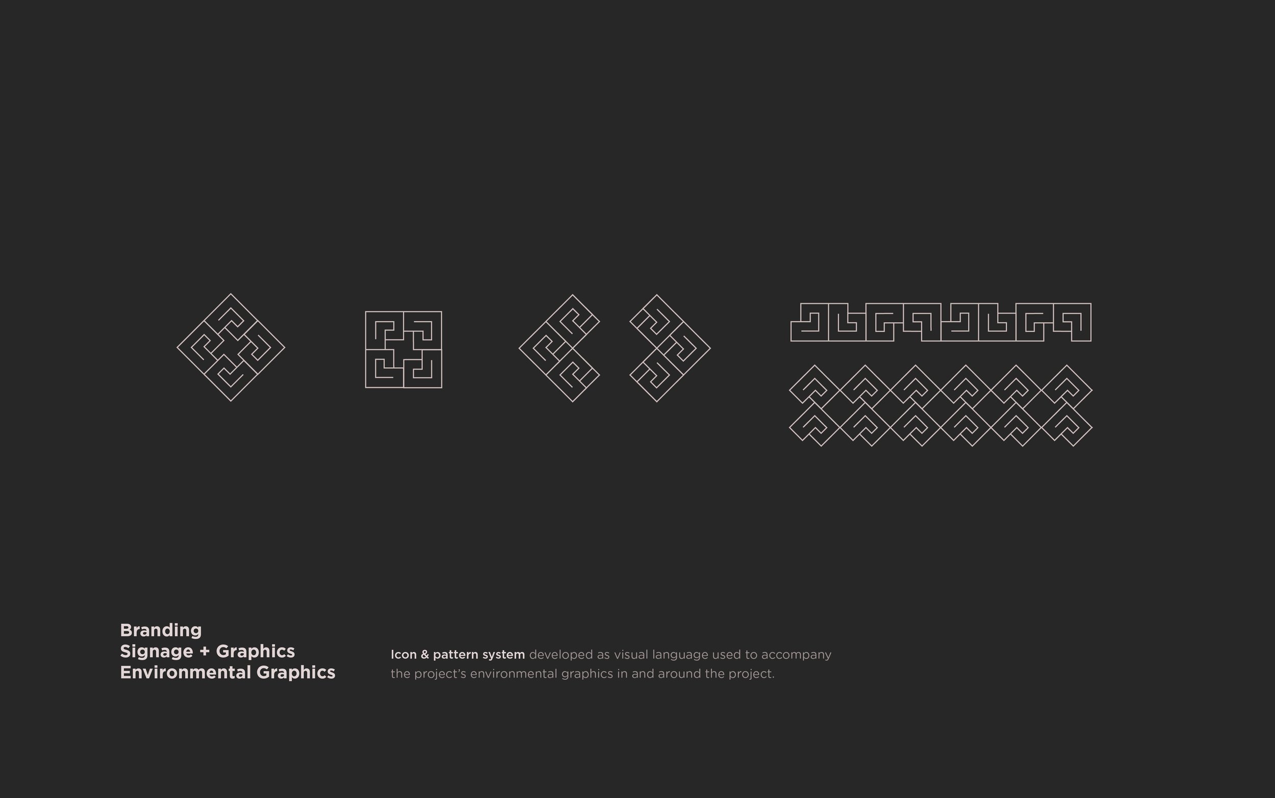
The mark at a 90-degree angle suggests the natural point break and the wave pool's A-frame. Inspired by a cresting wave, it symbolizes innovation, community, and positive momentum.
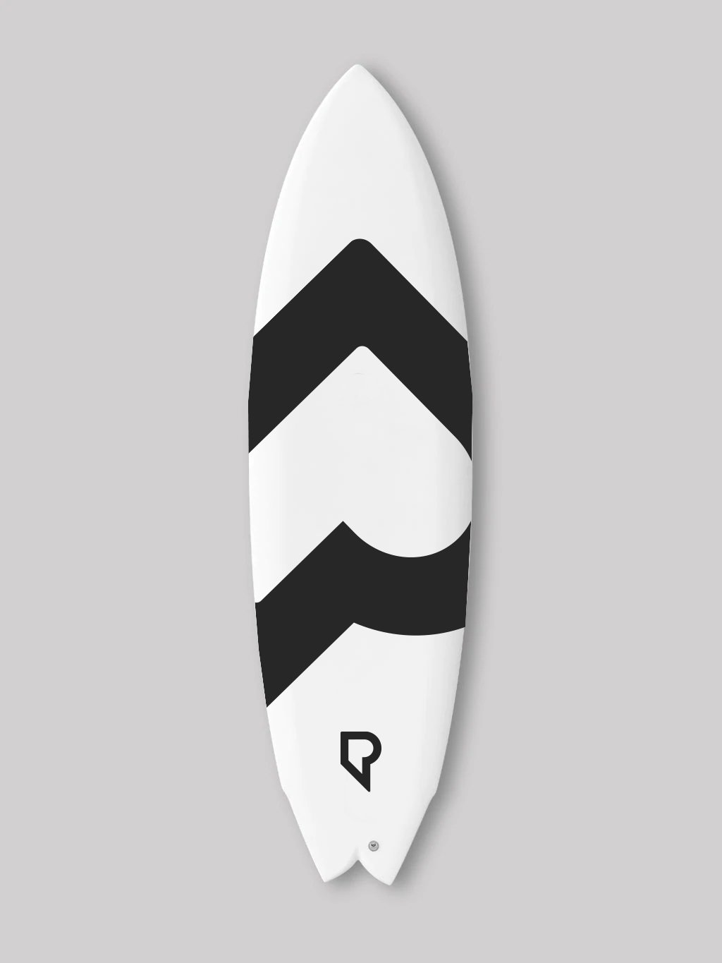


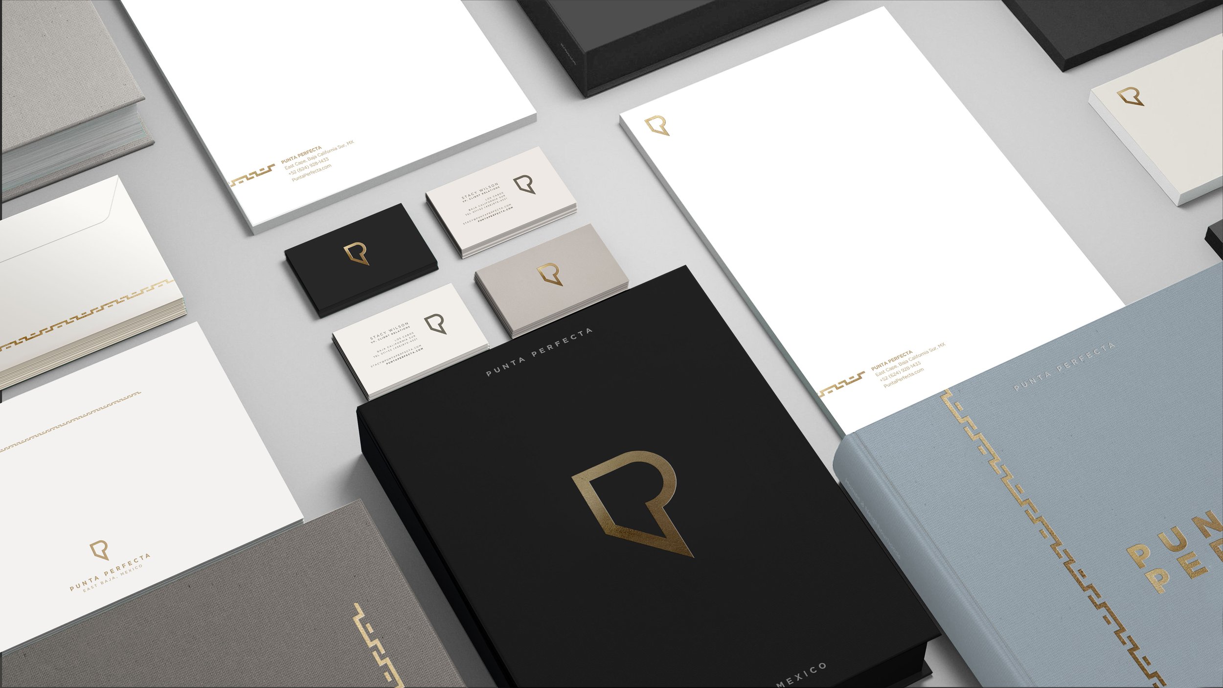
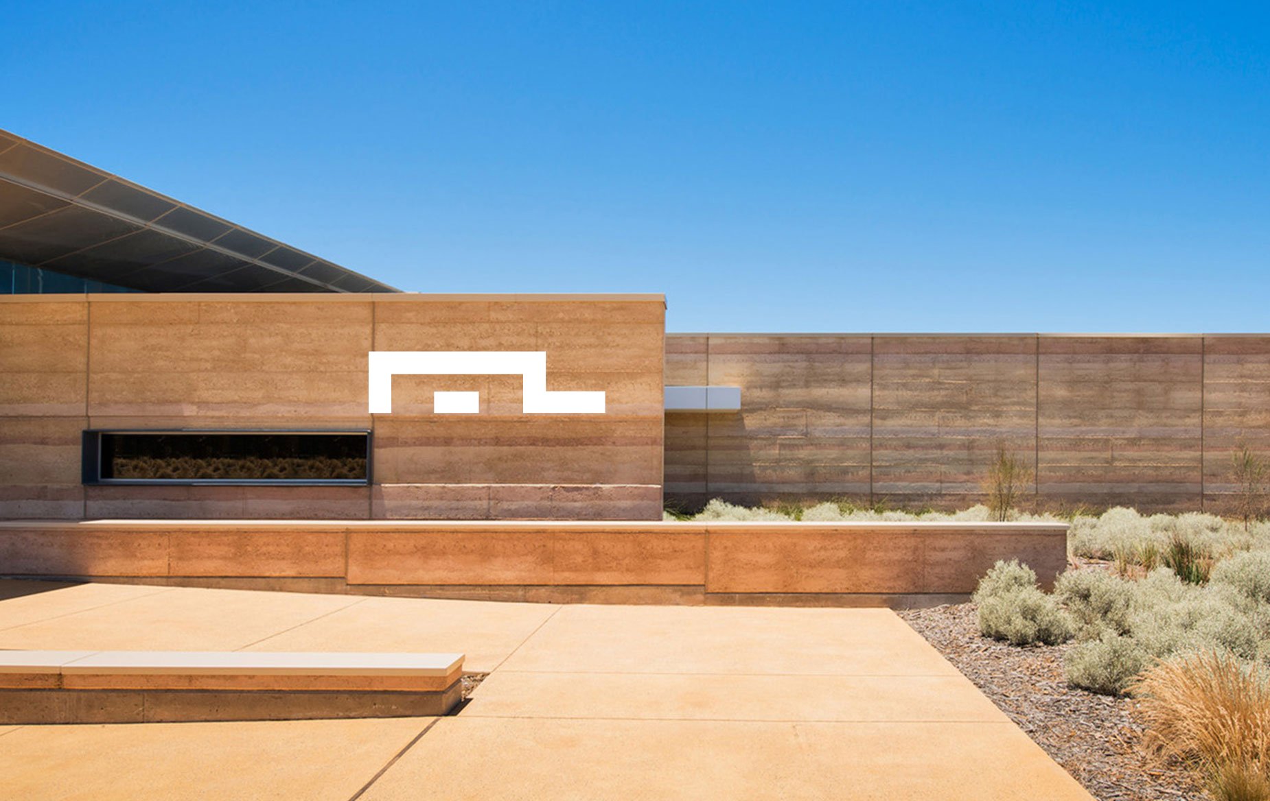
A horizontal capital P letterform is the foundation of this abstract mark. Its simple shape is suggestive of both a right-breaking barrel and the project’s low-slung modern architecture—with a rectangular element grounding the design in a nod to a sense of home. In addition, when the mark is repeated graphically, the pattern is similar to Mexican folk art, symbolic of the project’s Baja roots.
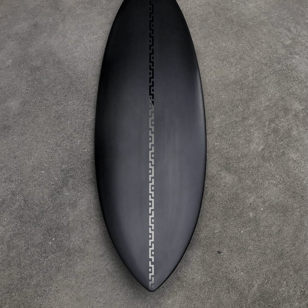


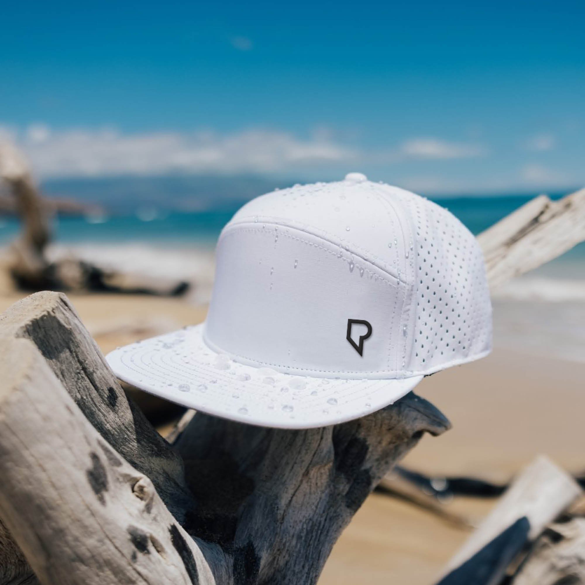
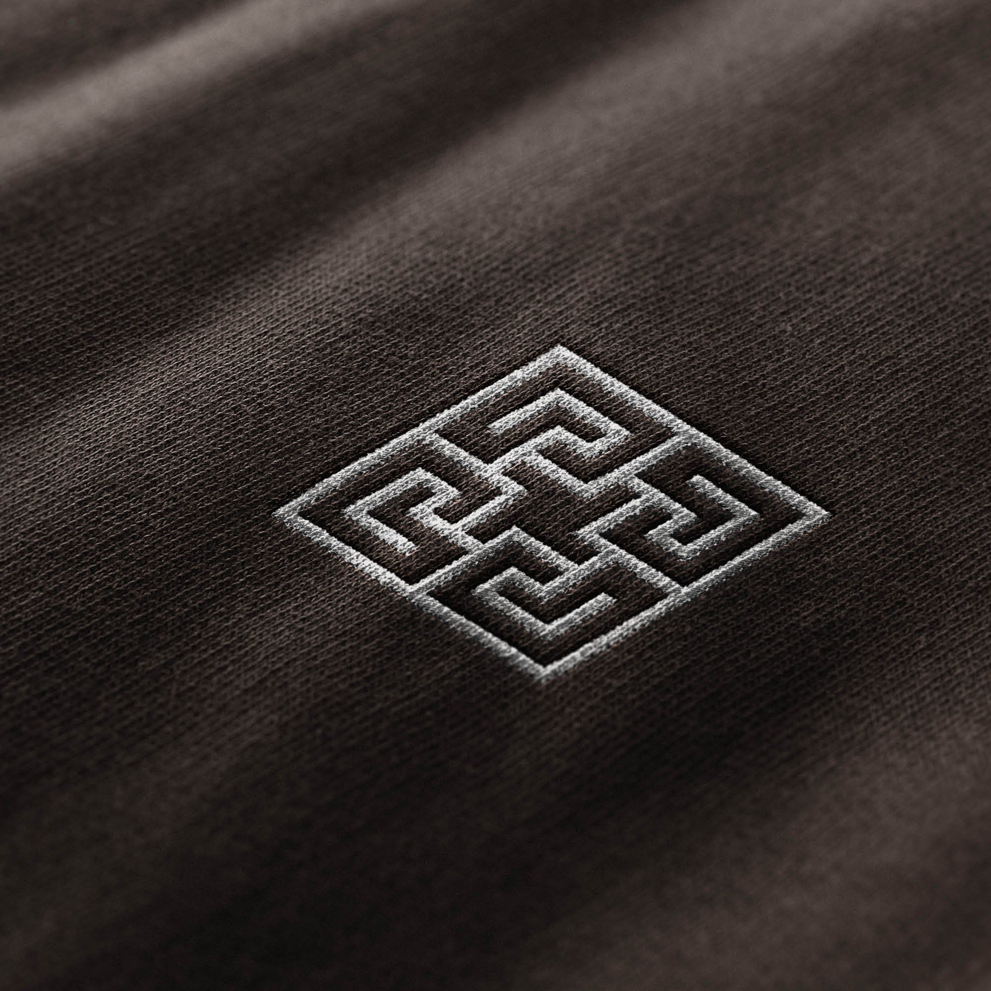
Additional visual language depicts a kinetic, double-letter P shape with an ‘interior void’—representing a surfer's view inside a barrel. Its angular geometry reflects the club’s modern architecture, and its enclosed feel conveys privacy.


-
Art & Design Direction: DK Yates
Sr. Copy: Bob Satmary
Agency: Intercom
Developer: Exploration Surf