
PORTLAND, OREGON
The Vera
Brand identity framework for a 203-unit affordable housing project developed by Bridge Housing on Portland’s South Waterfront .

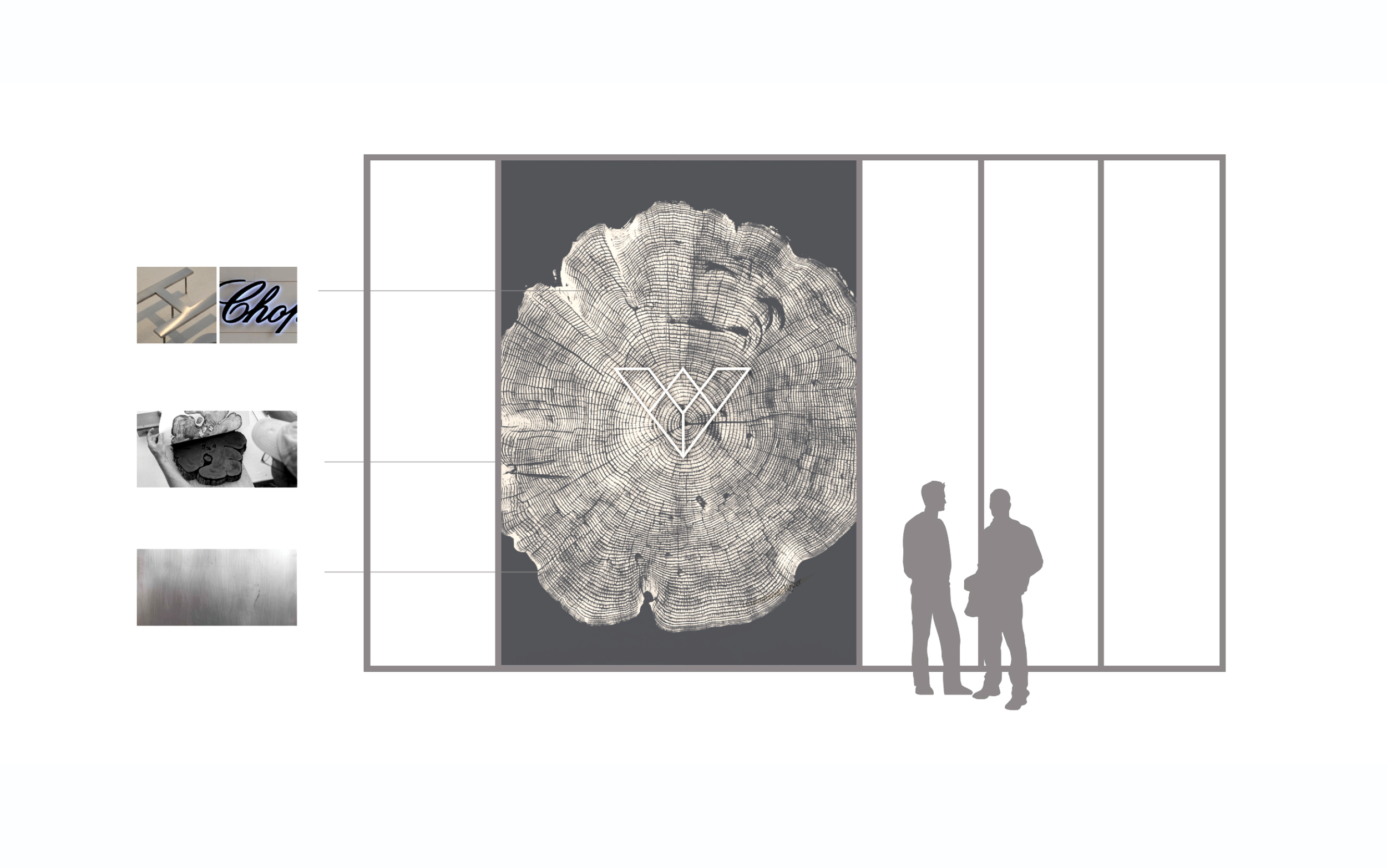
Drawing inspiration from the Sitka Spruce pine of the Pacific Northwest, this oversized woodblock print is rendered on brushed metal, subtly reflecting passersby. The logo pin, crafted from brushed steel, is centrally placed within the print. Each tree ring symbolizes a chapter in the tree's life, capturing the varying conditions of growth throughout the year. This design poetically acknowledges the past, present, and future growth opportunities for residents of The Vera.
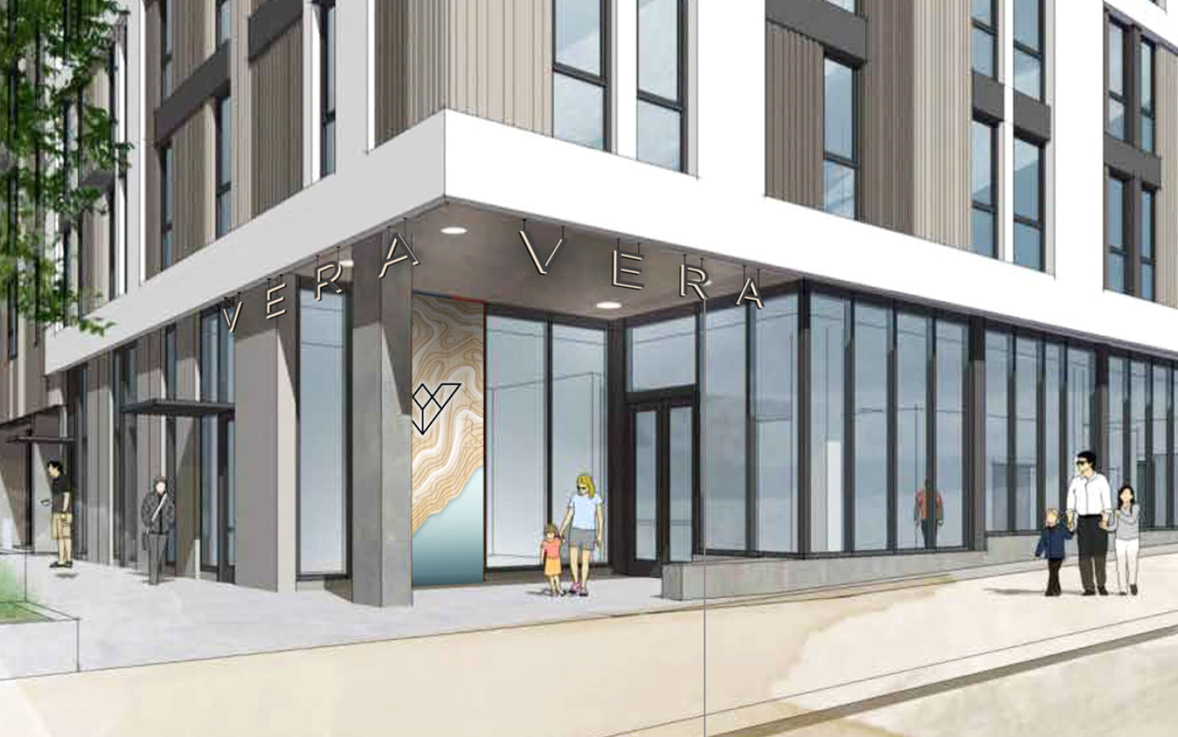


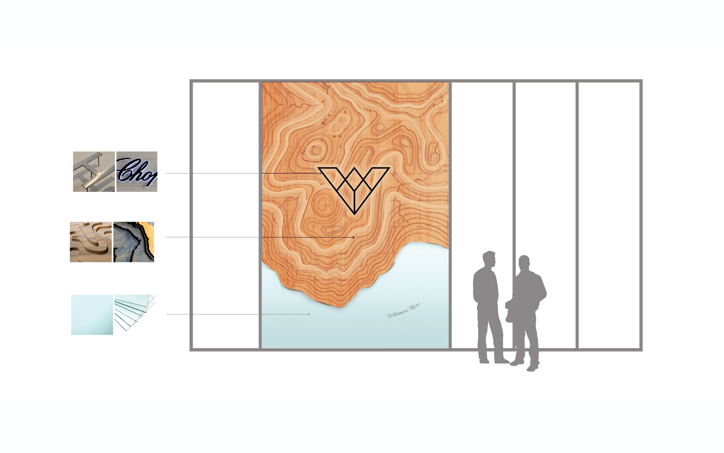
This concept subtly connects those transitioning through The Vera to the beauty of the Pacific Northwest and the strength of the Columbia and Willamette Rivers. A layered topo map made of reclaimed wood and illuminated seeded glass representing the rivers symbolize this connection. It serves as a reminder of rebirth and connection, resonating with diverse individuals starting anew.
-
Creative Direction: DK Yates
Sr. Designer: Kornelia Sneider
Client: Bridge Housing
Agency: Placewright/WHA